Choosing Rainbow Fabrics
Before the rest of today's post, I just want to thank everyone for all of the positive comments you've left recently, both on the giveaway post, and on my post announcing my new site (eeek!!). We're still working out the best way for me to respond to everything easily - some of our settings aren't being recognized by Wordpress at the moment, so I can't quickly and easily email you all back. I have read and appreciated all your comments, though, and want to respond to them :) It'll just take a little while to work out all of the kinks, but I'm still excited about the otherwise improved navigation and look of the blog! And now, onto the fabric selection process for an upcoming paper pieced block pattern. I have finished the block, but no photographs or pattern yet, but I'm going to share with you how I went about choosing fabric.
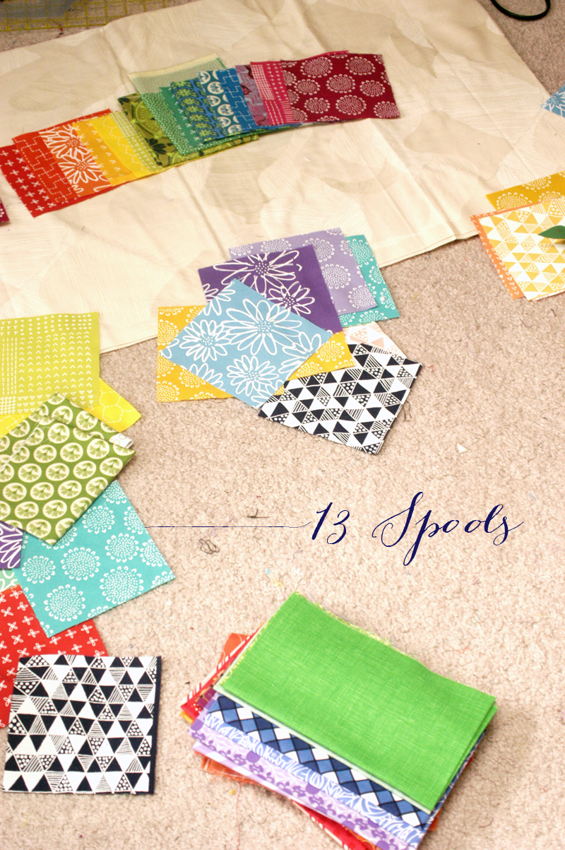
I opted for a rainbow; a common color scheme for a lot of you, but a first for me! I needed 16 colors that would gradate well together, and work around the full color wheel. I started with my Karen Lewis textiles.

Then I pulled out piles of other saturated fabrics to audition. I limited my choices to prints that were tone on tone, white on color, and had small accents if the accents were analogous colors. I started adding some to the mix.
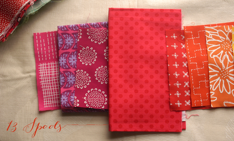
One especially problemsome area was the blue/purple range - I couldn't get a very smooth transition with just the screenprinted charms I had, so I added an Anna Maria Horner print (below photo, between the bright blue plus sign fabric and the pink fabric). It wasn't perfect - first of all, I still didn't have a true purple in there. Secondly, it's rather grayed down and not as saturated as the other prints. I decided to come back to it, since I wasn't seeing any obvious solutions in my stash at the moment.

I also saw pretty quickly that I needed another step between the red-violet and red...

...and this dotted fabric worked perfectly!
Done, maybe? Hmm, except, now I had a long stretch of white on color fabrics, since I only had Karen Lewis textiles and five other fabrics (mostly) thrown into the cool section. Now, the non white on color fabrics were starting to look...out of place. So, I pulled in a few other fabrics to try to even things out. I replaced some of the original fabrics, even if they worked well color-wise, in order to work in some other types of prints throughout the entire spectrum.

This helped me find another purple fabric and resolved the issues I was having with that section. At this point, I felt like I had a good gradation in color, and just needed to narrow it down to 16 fabrics. I had a lot of blues and greens, so after studying that area, I removed two more AMH prints. I liked the fabrics well enough, but some of her fabrics were a little grayed down to fit in well.

I was still happy with the gradation after this shift.

So there you have it! The completed range, all ready for the rainbow block. I'll be back asap with a pattern for you :)

And if you think the beginning stack looks the same as the end stack, well...that's ok. But I promise these were life or death decisions I made.