A New Background Fabric
Hey people. So first things first, I am horribly behind on my email. So thank you soooo so much for your feedback on the Tribal Rose quilt! Because of the positive response, I'm hoping to be able to get a digital BOM program out in the fall, with a print BOM program out for winter of 2016. And yes, I'll definitely be sure to make it accessible to quilt shops so that they can have them as classes/programs! (Thanks for the good question, Sharon!) And maybe I can go lead some of the months at the quilt shop in Fort Wayne, Indiana? That would be fun :)
And second things second, wow people hate yellow. I mean, holy cow. I was NOT expecting that kind of a response! My husband and I were laughing a little at how intense some of the comments were. I feel like there could be some sort of drinking game made for those comments, lol.
A number of people unfollowed me immediately after that last post. That's how much they hate yellow. Or just my foul use of yellow. Or maybe my recent posts have been crappy, and that pushed them over the edge? Eh. Who knows. Really rather amusing, overall.
But, onto the quilty point, which is that I have picked a NEW background color! And I'm in love with this one, so NO naysaying.
Just kidding.
Kind of.
Ok, but here it is:

I had decided on either navy or pink after my MQG friend came over for a playdate, but the husband did a horrible job of disguising his hesitance, so I made him share his thoughts.
Hubby: It's just really...intense.
Me: It is intense. Is that what you don't like about it?
Hubby: Ummm.....I mean it's really pink...
Me: Right...is it the color?
Hubby: No, I don't really think so. I think it's just...too much. It's really loud.
Me: Yeah....it is.
Hubby: Did you try Molli's suggestion? I think he's right - I think you need something more subtle.
Me: So less saturated.
Hubby: Right! Did you look at some less saturated colors?
Me: I mean...some...he suggested a bronzy-brown, and I don't have any browns to audition, and I don't really want to choose something off the color card again, since that didn't go so well last time.
Hubby: I think that's worth exploring a little more. It doesn't have to be brown, but definitely something more subtle.
So I dug out my small stack of subtle solids - mostly comprised of the ones from this stashing trip - and almost immediately found this grayed-purple. I love it. It's neutral, but then it's purple(!!). There's still color, but not too much.
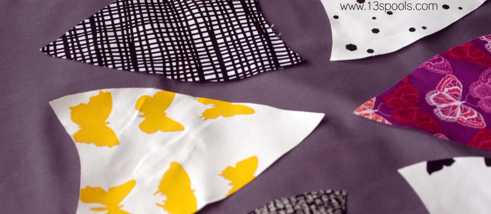
The purple undertones make the yellows pop, the low saturation keeps it from overwhelming the main prints or getting too loud, and the darker value means the secondary prints I chose blend into the background more. Score, score, score!

It's RJR crocus, for anyone who's interested! And for anyone who hates it - well....sorry, not sorry.
But lest you think I don't care about your feelings, I am sorry about that yellow. Let's move on past that one, now, shall we?