Hemming and Hawing
 ...and not hemming with a needle in the least.
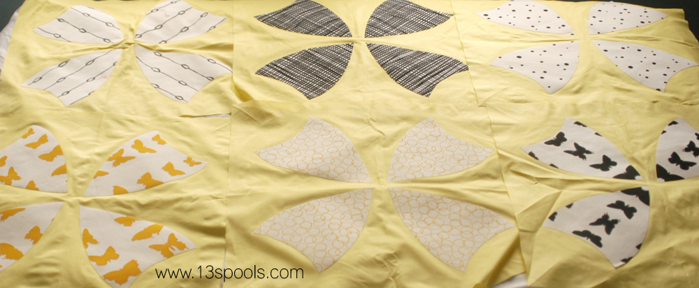
I'm pretty far along into making my quilt with my Colette Moscrop fabrics (stashing post here). I'm working on an applique version of a winding ways block. But honestly, I'm not feeling the yellow background.

Not one bit.

Ugggggggh.
That is one problem with ordering fabric from a teeny tiny swatch card - you can't lay all your fabrics out together and see how they play!
I think it looks nice, don't get me wrong. But 1) it's not me (and that probably only matters to me, but since I'm the one making it, well, it matters), 2) I think the yellow is giving the wrong fabrics the spotlight, and 3) I actually really dislike that yellow. I'm not really feeling like putting in any more time into a quilt that looks just fine/nice. I don't have that kind of time!
The super dark fabrics are standing out fantastically. But Colette's fabrics are taking second fiddle, and I don't like it.
I mean, those were the fabrics I loved and wanted to put in the spotlight. The others were my filler fabrics. And now it's making me cranky that it doesn't look that way (I know, I'm all rainbows and sunshine todayu, right?). So while I'm sure some people would love it, I just don't, and I really would rather make something I love. Ugh I sound like the queen of selfishness today. I sure hope you guys can see what I'm trying to say! Also, I miscut a bunch of times (I'm really skilled at miscutting), so I need to order more background fabric either way...

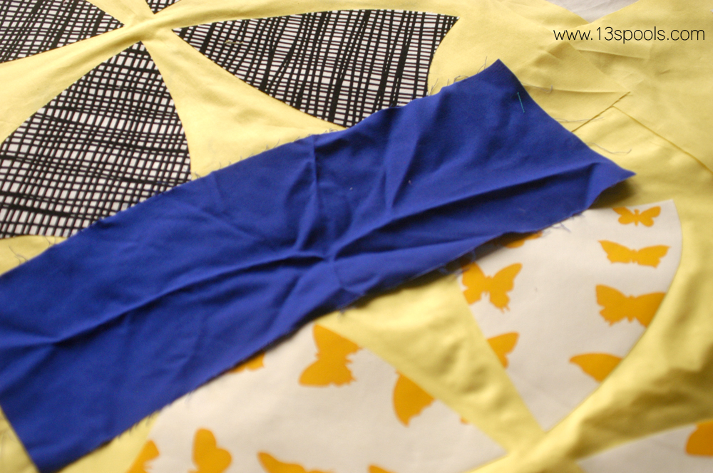
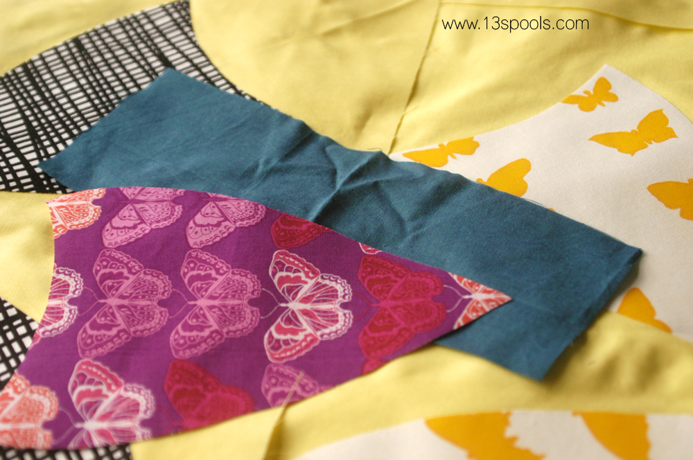
Soooo I'm auditioning other background fabrics...
This blue is fantastic. It really makes the orangey-yellow prints pop (success, right?). Not 100% on board with how bold it is, but otherwise, I really like it. The black crosshatch print looks nice, too - still defined, but definitely a backup singer.
This Kaffe Fassett shot cotton is one of my favorite solids, um, ever. I think it looks beautiful, and a little more sophisticated than the blue.

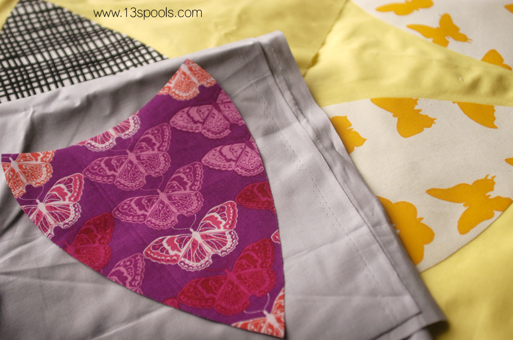
Gray is fine. Nothing too crazy.
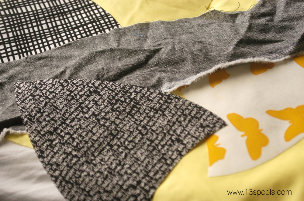
I love a linen, but this blends in far too much with the texty print.
So we're back to the green and the blue.
I'm leaning blue, but we'll see what the husband (and you guys) think...
